This is very annoying to me.
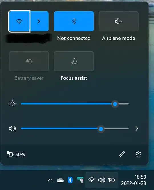
Windows 11 groups the network, volume and battery corner icons on taskbar tray. Like show on the following picture:
It also groups the interfaces of the respective popup dialogs, which annoys me even more.
For getting anything done, for example to connect to another wireless network, the user has to pass in more one hierarchy level.
Is there any way to get it more like the Windows 10 user interface? Thanks in advance.
