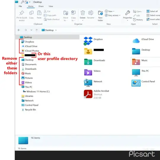
My father is turning 84 this year. He ain’t got the time nor the inclination to learn a new OS. Unfortunately, a new laptop purchase means that he is now “stuck” on Windows 11. And with Windows 10 EOL coming in 2025, there is a reasonably high probability that he will have to move to Windows 11 eventually anyhow.
Up to this point, I have been able to tweak the various versions of Windows to look remarkably like Windows XP, which is what he is most familiar with and enjoys. Unfortunately, Windows 11 has introduced an ungodly mess to the Windows Explorer sidebar.
And by ungodly mess, I mean an absolute UI clusterf**k, in that all the icons that you see directly within the folder tree (and beside/visually-above “This PC”) is also found within the user profile directory, which also sits at that same level. He has become deeply confused as to where he actually is in the file system due to this needless and extremely user-hostile duplication of folders.
Please note:
- I have completely disabled/neutered and removed the Quick Access, Library, & Home folders. I also find these to be exceptionally user-hostile, in that they also needlessly duplicate content in a highly confusing manner.
- This specific sidebar layout (“Show All Folders” under Options->View) is the one that most closely matches the old Windows XP folder tree layout. I will not be changing away from it, and please don’t bother recommending that.
For reference:
I am looking for either one of two solutions. Within the Desktop level, as in BESIDE “This PC”, and NOT WITHIN “This PC” I need either one of two groups of icons removed:
- All the folders that also appear within the user profile, or
- The user profile itself
Now, to be absolutely clear:
- 100% of all instructions on the Internet that I have found so far deal with folders WITHIN the “This PC” folder. As such, NONE OF THOSE SOLUTIONS WILL WORK.
- I am looking for a solution that will remove specific folders that are BESIDE the “This PC” folder, and leave either one group or the other.
- I need everything to remain within a folder tree branching off of Desktop, and not scattered over the sidebar like birdseed thrown on the ground. This is why Quick Access, Library, & Home folders have been forcibly removed entirely. Please do not advocate their usage.
- Strangely enough, the removal of the user profile directory is actually slightly more desired, since he will likely never need anything outside of Documents, Downloads, and Pictures. So not having the user profile directory there is actually the slightly more desirable outcome as it leads to greater simplicity. Most of his confusion comes from its contents being needlessly duplicated beside it. Unfortunately, any attempt to select that folder and delete it will provide a “removal successful” type message (which references desktop icon preferences to restore its visibility, if desired), but nothing changes. That folder remains visible.
- These limitations are a result of my father being 84 this year, and not in any sort of a position to be learning new tricks. He might be with us for only another six months, or he could hang on for another sixteen years. I just don’t know. But he is able to use what he knows, and he knows the more traditional XP-style interface. As such, I am trying my best to provide him with the latest OS, while tweaking it such that it gives the closest experience possible to XP. Including the start menu (solved) and the folder tree sidebar (unsolved), which are the two largest Win11 deviations with regards to how he uses the PC on a daily basis.
I have already had Winareo Tweaker recommended to me, however it cannot solve this problem due to two issues:
- It has the ability to remove items from “This PC”, which is not what I need.
- Both of the “Navigation Pane” entries also fail to do anything meaningful. Custom Items is completely empty, and Default Items only contains the standard items that have always been there like Libraries and This PC, not the User Profile items like Documents, Downloads, and Pictures.
Any assistance would be greatly appreciated, as this UI clusterf**k is driving my dad nuts.

