1

I am trying to create a combo chart with cluster columns and a line with a 7-day rolling average. One of the clustered columns is in percentages, the other is in whole numbers.

Here is the data set:Dataset

When I try to have the column with percentages on the primary axis and the column with the whole numbers on the secondary axis, it turns the chart into a stacked chart, even though I have selected "clustered column." It also changes the units on both axes.

Image:Combo chart view

I need the two columns shown as clustered columns, not stacked. How do I fix this?

This is what I'd like the chart to look like (I created this by hand to show as an example):Chart I'm trying to create
Khat
  • 13
  • 1
  • 3

1 Answers1

1

This is a 'feature' of having secondary axes, despite being clustered they appear on top of each other because they're both 'Series1' for the given axis. What you need to do is make Excel think that one is 'Series1 Axis1' and the other is 'Series2 Axis2'.

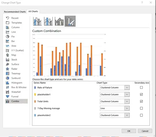
The easiest thing I find is to put in two additional series that contain all 0. You put one on the secondary axis but that appears before your actual data, and the second one should be on the primary axis after your actual data. If you only add a blank series to one of the axes you won't get the proper offset you are after,

screenshot of Change Chart Type dialogue box

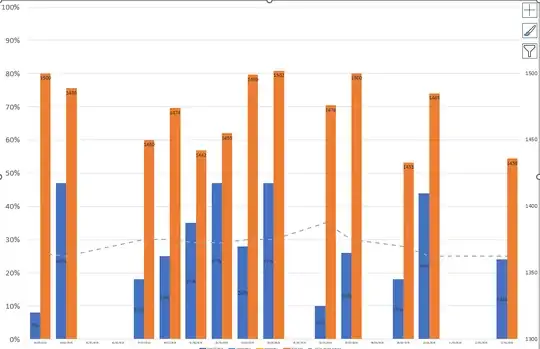
If you've got it set up right you can then make the chart look like this - for me I had to adjust the Series Overlap & Gap Width, fix the axis Minimum and Maximum Bounds etc but I think it is what you're after.

screenshot of chart showing clustered columns that actually look like clustered columns and not stacked columns