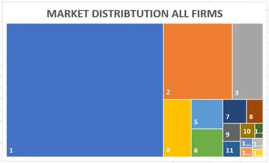
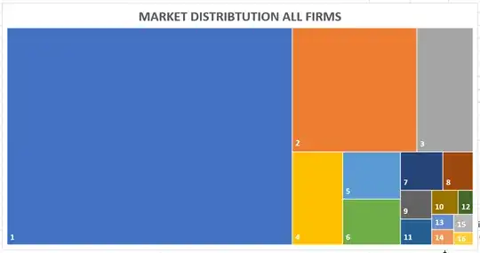
I'm creating a treegraph in Microsoft Excel, but my labels get truncated unnecessarily. See the image below:
As you can see, the second digit of the labels of the smallest rectangles, which are the numbers 12 to 16, have wrongly been replaced with three dots. The three dots are larger than the actual character they are replacing, making the sizing problem even worse.
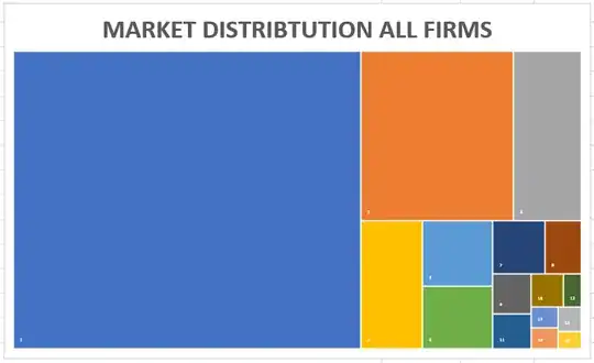
Of course a simple solution is too simply resize the chart or lower the label font's size, but this isn't as aesthetically pleasant. The font simply gets unnecessarily tiny:
I have looked online and searched Microsoft's documentation, but I couldn't find any solution. Does anyone maybe have an idea how I could disables Microsoft auto truncation or does anyone have any other ideas how I could get a nice looking graph?
The data visualised is btw as follows:
| 1 | 2 | 3 | 4 | 5 | 6 | 7 | 8 | 9 | 10 | 11 | 12 | 13 | 14 | 15 | 16 |
|---|---|---|---|---|---|---|---|---|---|---|---|---|---|---|---|
| 3306 | 825 | 370 | 250 | 146 | 141 | 88 | 62 | 48 | 34 | 43 | 19 | 18 | 18 | 18 | 13 |


