I am preparing a chart for an academic journal and am struggling with formatting.
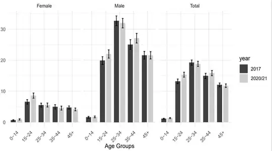
In the original chart I am trying to reproduce, nested data for two year periods, 2017 and 2020/21, are displayed side-by-side and then grouped by age range and ultimately gender.
On trying to reproduce the chart to align with the journal's requirements for editable figures, I am able to create the following, but as you can see it is not ideal.
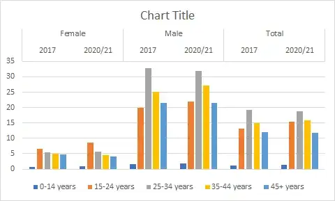
While I am able to get the data to group correctly, I'm not sure how I would go about displaying the data from two time periods side-by-side so that there are only three clusters altogether. This this possible? Any help in this regard would be greatly appreciated.
| 0-14 years | 15-24 years | 25-34 years | 35-44 years | 45+ years | ||
|---|---|---|---|---|---|---|
| Female | 2017 | 0.64 | 6.56 | 5.52 | 4.96 | 4.74 |
| Female | 2020/21 | 0.93 | 8.58 | 5.56 | 4.57 | 4.12 |
| Male | 2017 | 1.61 | 19.88 | 32.72 | 25.05 | 21.59 |
| Male | 2020/21 | 1.73 | 22.01 | 31.95 | 27.09 | 21.59 |
| Total | 2017 | 1.13 | 13.21 | 19.23 | 14.93 | 12.06 |
| Total | 2020/21 | 1.33 | 15.33 | 18.83 | 15.85 | 11.78 |

