I am trying to create a visual representation of Service Hours for a customer.
The customer contracts with us for 1+ years. When they purchase a service package, they buy a number of hours that they can "spend" to work with our Professional Services, Solutions Architecture, etc teams. Those hours are allocated annually and unused hours roll over.
Example:
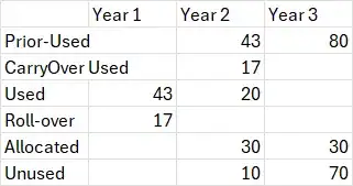
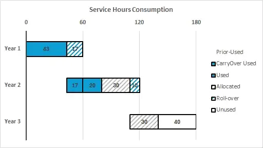
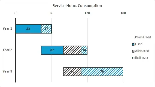
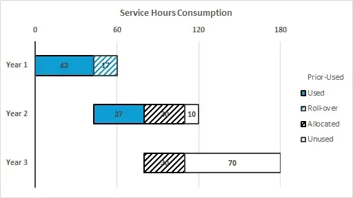
Customer under a 3 year contract purchases 180 hours, 60 hours per year. Last year they billed 43 of 60 hours, rolling over 17. This year they have billed 37 hours, consuming the 17 roll-over hours and 20 hours from the current year. 30 hours have been scoped for outstanding projects this year and 30 hours have been scoped for projects planned for next year.
The simplest descriptor of what I'm trying to accomplish is a stacked waterfall chart. Part stacked bar (X of Y hours consumed) and part waterfall (Year 1, 2, 3 etc as components of the total purchase).
The excel workbook I've developed for this 3-year contract looks like this.
I would like the resulting visualization to look like this: Service Hours Consumption Report
I haven't been able to accomplish this via stacked bar charts, even deleting/hiding bars, but its possible that I might need to restructure my data and it would work that way. I'm hoping this forum can provide some guidance, so thank you in advance.
Context for comments/solutions: Data with columns added


