1

I have a table of population amounts recorded sporadically by date. I want to make a line chart in Excel that displays the population data over time with day-specific information but with the X-axis labeled by month and year.

So for example, if I have the following data:

| Date       | Population |
|------------|------------|
| 2024-01-10 | 1274       |
| 2024-01-18 | 1294       |
| 2024-02-12 | 1340       |
| 2024-02-15 | 1323       |
| 2024-03-05 | 1368       |

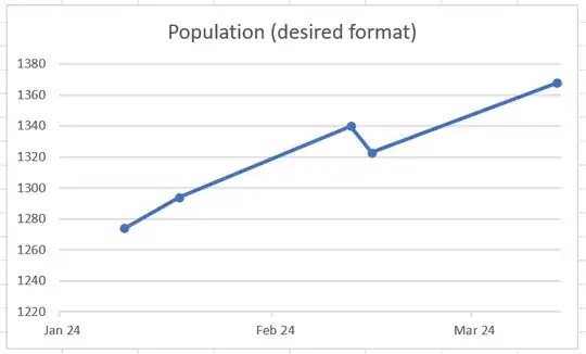
I want my chart to look like the following:

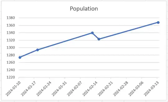
However, when I select my data and insert a line chart with markers, it shows individual dates as my x-axis labels instead.

How do I change the X-Axis of my line chart to show month names and years instead?

Stevoisiak
  • 16,075

1 Answers1

2

Use the Format Axis menu to set your Minimum Bound to the start of the month, change your Major Unit to 1 month, and set a custom date format of mmm yy.

  • Insert a line chart for your data. (Insert > Charts > Line Chart)

  • Right click the x-axis on the line chart and select "Format Axis"

    Format Axis button

  • On the "Format Axis" sidebar on the right, click the Axis Options Axis options icon icon.

  • In the Axis Options submenu, set your Minimum Bound to the first day of the first month of your data (In this case, 2024-01-01)

  • Still in Axis Options, set the Major Units to 1 month

  • Open the Number submenu, enter the Format Code mmm yy, and click "Add"

    Format Axis menu with correct settings

See Also:

Stevoisiak
  • 16,075