I have three columns of data. Column 1 has a short description, column 2 has a benefit number and column 3 has a cost. I can create a cost/benefit scatter chart, but what I want is to be able to have each point in the scatter chart be labeled with the description. I don't care if you can see it on the chart or you have to roll over the point to see the description.
5 Answers
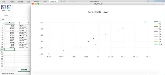
I propose one tool named Funfun that can solve your problem. With this tool, you can use an external JavaScript library to plot the scatter chart with a description that meets your needs.
I wrote a function for your problem. Here's the code of the main part:
<script>
    var data = $internal.data; // use Funfun API to get the data
    var plot_data = [];
    for(var i=0; i<data.length; i++){ // data preprocessing to fit in Plotly.js
     var trace = {
      x: [data[i][0]],
      y: [data[i][1]],
      type: 'scatter',
      name: data[i][2]
     };
     plot_data[i] = trace;
    }
    var layout = {
      title: 'Data Labels Hover'
    };
    Plotly.newPlot('myDiv', plot_data, layout); // use Plotly.js to plot the chart
</script>
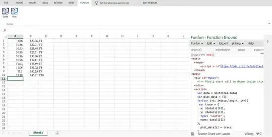
In Excel Online it's as shown below: you can write codes in the right pane. As mentioned in the code, I use plotly.js to plot the chart.


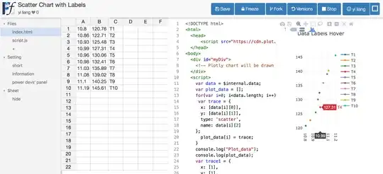
The link https://www.funfun.io/1/edit/5a3772cd45ac15144af3fe9d of this function. You can link this function to your Excel with Funfun and this URL.
Besides, Funfun also provides an online playground which shares the same database with Funfun in Excel add-in. You can also click the link above to see what it's like in website version.

P.S. I'm a developer of Funfun.
- 41
There's another free utility (and tutorial on how to create it) available for download here: http://www.wiseowl.co.uk/blog/s130/excel-charts-data-labels-problem.htm
At first, I thought you could accomplish this with a 'bait and switch' - make a plot of the data first, then edit the series. Doesn't work though. This works if and only if the numbers in column 'B' are whole numbers. The excel chart isn't really using any of the data in column B anymore.
The only way I have been able to reliably do this in the past is to make every row of data it's own data series. Painful, but if you want to see it in action, I have an example excel file.
- 14,761
The wiseowl.co.uk utility worked for me. As a "tutorial" I would recommend
Downloading this Excel worksheet, from part five of this blog and enabling macros http://www.wiseowl.co.uk/files/blogs/s130/i3.xlsm
Move the button down and out of the way of your data if you have more than a few columns
Paste your data in on top of the film data.
Create scatter plots by selecting two column at a time and insert scatter (plot).
Clicking on the button, which will add labels.
Easy.
Thanks to the folks that made it and recommended it.