I've been at it for over 2 hours now and am just a bit flustered :)
I have the following data (for example):
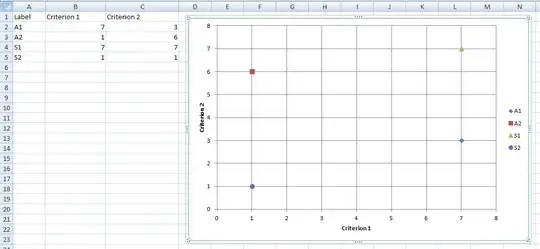
Label | Criterion 1 | Criterion 2 |
  A1  |      7      |      3      |
  A2  |      1      |      6      |
  S1  |      7      |      7      |
  S2  |      1      |      1      |
All I wish to see is a scatter plot with Criterion 1 and 2 as the X and Y axes and the 'label' elements as values on the graph (i.e. each 'dot' on the graph is labeled as whether it belongs to A1 or A2 or S1 or S2). Basically the items under the label column being shown as a legend. So it looks like this:
  A
C |
r |
i |                            Legend
t | ^      +                   ^ A1
e |                            + A2
r |                            # S1
i | *                          * S2
o |      #
n |
2 |
  +-------------------->
       Criterion 1
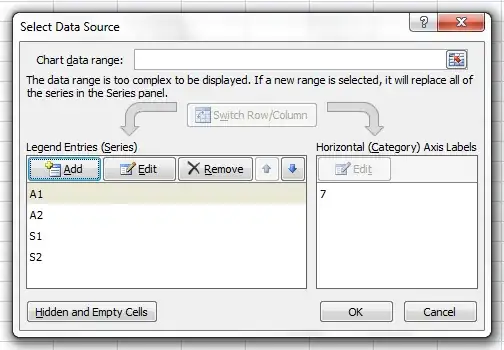
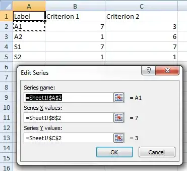
I'm sure this is NOT rocket science but I'm getting the most weird graphs imaginable if I just select all 3 columns (label, criterion 1 and 2) and ask for scatter plot. I've tried playing around with everything and for some reason the scatter plot just doesn't show up the way I want it to! Here's how it looks:

I've pretty much given up :( Any ideas?