3

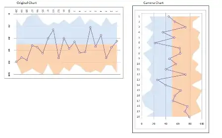
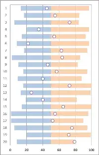
I'm desperately trying to layer an area chart on top of a a scatter plot in Excel 2013.

The scatter plot has been successfully used to visualize the deviation from the mean of different Key Performance Indicators (KPIs) to see how several business entities perform relative to each other. Basically, my x-axis is a percentage value, and my y-axis is a list of KPIs (or for the sake of the chart, some numbers from 1 to n). Works perfectly fine.

What I would like to do now is to add a "corridor" to see the minimum and maximum values. I can actually add a maximum and minimum line, but have failed to change it into an area.

Here's a screenshot and a demo file so you can see what I mean:

enter image description here

Excellll
  • 12,847
danpo
  • 33

1 Answers1

1

As I mentioned in the comments above, you could do a quick "cheat" and use the Camera Tool to create a picture that could then be rotated to your desired orientation (i.e. vertical, although it could be any angle).

KPI example chart with camera

But, in looking at what you're trying to accomplish-showing your KPI's within a range of min/max-I suggest choosing a slightly different (and easier) chart. Consider using a Stacked Bar Chart. You can use the stacked bars to create your corridor (without needing to resort to the camera trick). It also is a slightly better representation of your data. Assuming your KPI's aren't chronological values (i.e. the same value repeated at some set interval and charted over time), your data is categorical. And line charts aren't good for categorical data because the line implies that your values follow that path-which isn't necessarily true for categorical data. So a stacked bar chart is easier and a better representation of your data.

KPI bar charts

dav
  • 10,618