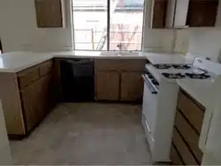
The old kitchen
The house was built in 1980, and the old kitchen that was to be replaced was probably original from that year. This kitchen was high-style 1980s, with a lot of features that were typical for that time period in kitchen design, and actually beautifully and professionally designed, much more inventive and better thought through than many kitchens that I have seen from later periods. It was certainly the work of an architect and not just that of some builder or developer.
The kitchen was preserved as a time capsule for the sole reason that the house had been rented out for decades; the owners' philosophy had been to invest only as much money into the property as was necessary to keep it in a rentable state. So from a preservationist's point of view, it may have been a questionable decision to destroy and to update this kitchen, but the 1980s are not my favorite period of design anyway and so we decided to kick off.
But first, I want to give you the full picture. For somebody who is not a designer by profession but is up to design a kitchen anyway, it will be extremely helpful to study every example they can get hold of. Even if you hate your old kitchen, I believe it is very much worthwhile to thoroughly study it, and to identify what is good about it and what you really want to be different.
The old kitchen
| Image
|
Pluses
|
Minuses
|

|
- the U-shape is very good because it establishes a confined space for undisturbed work with no thru-traffic
- a lot of closet space close to the kitchen
- pass-through (near the sink) that connects kitchen and the dining area in the adjacent living room
- the interestingly complicated shape and the lowered ceiling add a cozy feel (if you like cozy)
|
- the U-shaped space is only large enough for 2 people max. working there
- no work triangle between sink, range, and fridge
- long walking distance between kitchen and dining area
- labyrinthic hallway shape
- three different ceiling heights only for technical but not for aesthetic reasons
|

|
- breakfast area, adjacent to the bedrooms and with morning sun
- large patio door, inviting to have breakfast al fresco
|
- cheap and outdated vinyl flooring
- flush ceiling lamp: ugly to look at and gives ugly light, too
- popcorn ceiling (souvenir from the 1980s)
|

|
- kitchen peninsula with a bar, for kitchen spectators or just those who like perching on a bar stool
- large number of cabinets, some of them hung directly to the ceiling, which was a novelty from the 1970s and sort of cool
- sleek look of the handleless drawer fronts and cabinet doors
|
- cheap laminate countertop
- vintage, worn-out cabinets (laminate) with icky interior shelves
- drawers don't run on slides but on wood
- handleless drawer fronts and doors should have a push opening system, but those don't
- cabinets with modern appearance and full overlay should be frameless for efficiency, but those are framed
|
|
- sink at window with a lot of daylight, and a view
|
- dishwasher cramped into a corner: when the dishwasher's door is open, the doors of the adjacent cabinet must remain shut, so stuff cannot be cleared out from the dishwasher directly into the cabinet
- the oven is deeper than the base cabinets and sticks out
- the corner cabinets at the right side of the sink (wall and base) offer mostly dead space
|

|
- double sink (if you actually need that)
- in-sink-erator
|
- double sink (if you don't need that)
- the sink's enamel is chipped
- metal cover around the sink's edge: a favorite spot for dirt to get caught
- countertop is extended to the window which was obviously a design idea, but it makes an odd transition between both elements
|

|
- clean look: recessed lighting
|
- recessed lighting: yesteryear's equivalent of can lights, only that they had to bring the whole ceiling down to fit it in; and it still doesn't light the countertop, because of the shadow that you cast while you stand in front of it
|

|
- gas range and oven (if you like that)
- the range hood is actually venting to the outside
- the cabinets reach up all the way to the ceiling: good use of space and no need to clean the top sides
|
- gas range and oven (if you don't like that)
- the range hood is worn and outdated, poorly lit and hard to clean
- the refrigerator is much deeper than the cabinets and sticks out; the wall cabinet above the fridge is hard to reach
- no under-cabinet lighting
- the backsplash is an extension of the laminate countertop and not much to look at
|

|
- nifty: the pantry is located in the passage way that leads from the hallway to the kitchen; if a passage way is necessary somewhere in the house, I believe it is a great idea to use this space for still another purpose than just traffic
|
- a pantry with no drawers whatsoever: how do you keep track of what is in front of those cabinets and what is hidden in their depths?
|

|
- the hallway that connects the dining area to the kitchen (and to the bedrooms) features a closet
- carpet (if you like that)
|
- the hallway is a tunnel experience: long, dark, narrow and very low (no chance to raise the ceiling because it contains ducts of the forced air heating system)
- carpet (if you don't like that)
- more popcorn ceiling
|

|
- at the rear end of the hallway there is – around the corner, close to the breakfast area – another closet
|
- again: no drawers
- the L-shape of this narrow hallway gives it the feel of a maze
|
