I am able to plot the time-series data using ggplot2. However, I want to highlight the seasonal information alongwith the time-series data.
Here's my code:
library(zoo)
library(ggplot2)

a <- read.table(text = "
       Season Quarter  Sales
       Season1  2014Q1  20
       Season1  2014Q2  40
       Season1  2014Q3  60
       Season1  2014Q4  80
       Season2  2015Q1  30
       Season2  2015Q2  40
       Season2  2015Q3  80
       Season3  2015Q4  90
       Season3  2016Q1  100
       Season3  2016Q2  120
       Season3  2016Q3  140
     ", header = TRUE, sep = "")
a$Quarter<-as.yearqtr(a$Quarter)
a$Quarter<-as.Date(a$Quarter)

ggplot(data=a,aes(x=Quarter, y=Sales)) +
       geom_line()
This works well in that I am able to draw a time-series data.

Now, I want to label what constitutes Season 1, 2 etc. One way to do this would be to use color or linetype. However, this doesn't seem to work because it breaks the continuity of the time-series.
# doesn't work...
ggplot(data=a,aes(x=Quarter, y=Sales)) +
       geom_line(aes(linetype=Season))
On the other hand, I like how Excel plots this graph in just two clicks. It creates a beautiful graph that shows seasonal information on x-axis along with dates. It essentially creates a 3-layered x-axis.
I have two questions on this topic:
Question 1: Using ggplot, how can I use linetype (or color) in ggplot to create continuous graph (i.e. without breaks)? I'd prefer linetype over color.
As an example and to answer the comment: here's the graph I created using a different set of data.
df <- data.frame(x = 1:3, y = 1:3, z = c(1,3,5))
ggplot(df, aes(x, y, color = factor(z))) +
       geom_line(aes(group = 1))
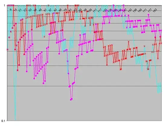
I am unable to replicate above behavior for time-series data. Here's the graph I got from above code:
Question 2: Using ggplot, how can I create a multi-level x-axis (similar to what Excel did for me) that shows Seasonal information with dates? {Please see Excel graph that I created.} I do NOT want to create a legend using this option. I also want to clarify that I'd appreciate if we don't use hacking methods by applying annotate (or possibly geom_text) methods to put these multi-level labels by adjusting and re-adjusting x- and y- values to fit them. This is because it defeats the purpose of using programming language to draw the graph, and it won't work as the data change.
If you have any questions, please let me know. I'd appreciate your thoughts. I am an absolute beginner with ggplot2. It's been only 5 days since I have transitioned from Excel and STATA to ggplot. So, I apologize if my question is too basic.
I researched this topic on SO and couldn't anything that is close enough. For instance, this thread talks about changing ticks, but not what I am looking for.


