26

I have switched my programming environment from Windows 7 to Mac OS X Lion, and I missed the Windows' crispy front rendering, for example, under Eclipse, you can check the screenshots.

OS X:

Windows:

Of course there are differences in font family and size, but the Windows version seems has better font rendering.

Are there any setting in OS X I can improve the typography?

slhck
  • 235,242
Yoga
  • 649

4 Answers4

21

Some time ago, while preparing a presentation for a client that was to be viewed using a Mac, I've faced the same issue.


Tweak

A simple tweak to the anti-aliasing improved the rendering of fonts for the monitor used:

  1. Open the terminal: Applications → Utilities → Terminal

  2. Type:

    defaults -currentHost write -g AppleFontSmoothing -int 2
    

    You can use numbers between 1 and 4. Four is the default one.

    For me, I've got the desirable result using the value two.

  3. Restart the OS.


Comparison:

I didn't perform any comparison, but users from the link below have compared the improvement using Chrome.

  1. Use Chrome and load a website on the first tab;

  2. Apply a difference value from the above command line reference;

  3. Open a new tab and access the same website;

  4. Compare by looking at both tabs side by side.


Credits:

Credits on this solution to: tonymacx86 at http://tonymacx86.blogspot.pt.

Pang
  • 1,017
Zuul
  • 3,815
12

System Preferences had an option to use a lighter text rendering style, but it was removed in 10.6. You can still use it by modifying property lists though.

defaults write -g AppleFontSmoothing -int 1
sudo defaults write -g AppleFontSmoothing -int 1

The second command is needed for windows shown by processes owned by root like the force quit window.

I've always used the light setting. It's closer to the weight of printed text and makes especially Japanese text and light text on a dark background look better in my opinion.

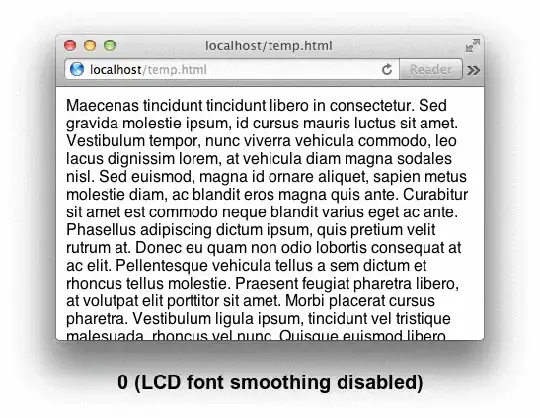
Eclipse doesn't seem to support subpixel rendering on OS X, so text might look different in it than in native applications. I can't tell it from the screenshot, but check if LCD font smoothing (subpixel rendering) is enabled.

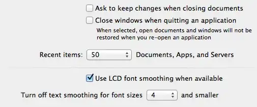
If clicking the checkbox has no effect, it might be because subpixel rendering is not enabled automatically on some LCDs. Setting AppleFontSmoothing to 2 or 1 might force it to be enabled.

Lri
  • 42,502
  • 8
  • 126
  • 159
1

There are a two settings in the System Preferences > Appearance pane.

If you change the size at which font smoothing is turned off I think it will look sharper.

There is an option to turn LCD font smoothing on/off but I can't see a difference, I think it's sub pixel smoothing on LCD screens, so probably screen specific. I have it turned off.

piddl0r
  • 131
1

Although you cant turn off the font smoothing on OSX you can try a few things to mitigate it

Coping with OSX font rendering

There is also an Apple Support article that deals with this issue too.

VBwhatnow
  • 2,227