I'm struggling while trying to plot simple data into a simple chart in Excel (2010 beta).
My data is a very simple one:
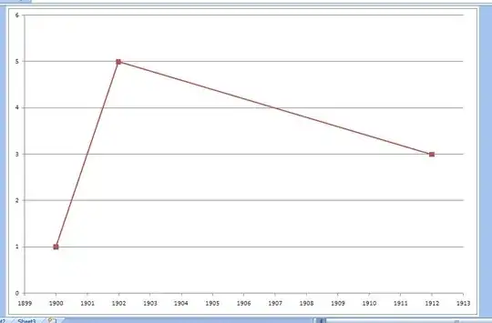
Value    Year
-----    ----
1        1900
5        1902
3        1912
etc. In the chart, I want year to be the X axis and the value to be the Y axis, and have a single line mapping the change in value over years.
When I select my data, Excel wants to map both at the same time, rather than plotting each pair as a point on the graph.
How the heck do you do this?