I don't think this should be difficult, but I'm pulling my hair out trying to do it.
I am trying to make a chart of age vs BMI. I have a column with age and a column with BMI. The table looks something like this:
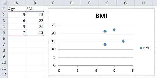
-------------
| Age | BMI |
-------------
|  5  |  13 |
|  6  |  22 |
|  5  |  21 |
|  7  |  15 |
There are more columns, but that isn't important right now. I want the BMI to be on the Y axis (easy) and the age to be on the X axis (surprisingly difficult). If I use a line graph I can select the age to be x value using Chart Tools > Design > Select Data, but that does not stack the values. In other words, all of the age 5 data points would not be aligned vertically. The x axis for my example above would look like this:
-----------
|  |  |  |
5  6  5  7
If I sort my table by age I would get something like this:
-----------
|  |  |  |
5  5  6  7
If I try to make a scatter plot I get the same results.
I have tried the suggestions in the thread below, but they all give me the same thing. Please help.